Why I Love Flodesk: The Glow-Up and the Features I Can’t Stop Using


Partner disclosure: I’m a Flodesk partner, which means I may earn a commission if you use my link. I only recommend tools I genuinely use and trust.
If I had to pick one tool that consistently makes my clients say “Wait… how did you make your emails look so good?” it’s Flodesk.
Email marketing used to feel like the awkward, overlooked corner of branding. You’d spend hours building a stunning visual identity… only to send it into the world through a clunky template that looked nothing like your brand.
And honestly? Most legacy platforms haven’t done much to fix that. They’re functional. They’re fine. But they’re not beautiful, you can’t fully customize them, and they definitely don’t feel intuitive.
Flodesk changed that for me!
What I Wanted in an Email Platform

I look at everything through a brand lens . Consistency, experience, storytelling, the whole thing. So when the inbox becomes a weak link, It drives me nuts!
I wanted:
- A platform that made emails feel like an extension of my brand
- Tools that didn’t turn designing an email into a part-time job
- A User friendly backend that didn’t require a tutorial and a prayer
- Automations that didn’t feel like mission control
Flodesk slid right into place. It felt modern, intentional, and honestly… fun.
Why Flodesk Stole My Designer Heart
1. The design quality is unmatched
This is the biggest differentiator. The templates aren’t “templates” — they’re refined, editorial-level layouts that make even a simple update look like a branded experience.
Everything is customizable, intuitive, and actually enjoyable to build. If you care about aesthetics, this is your platform.
2. It’s sophisticated without being overwhelming
There’s a sweet spot between “too basic” and “I need a 12-hour course to send a welcome sequence.”
Flodesk sits right in that middle lane. You get the features you need, without the clutter you don’t.
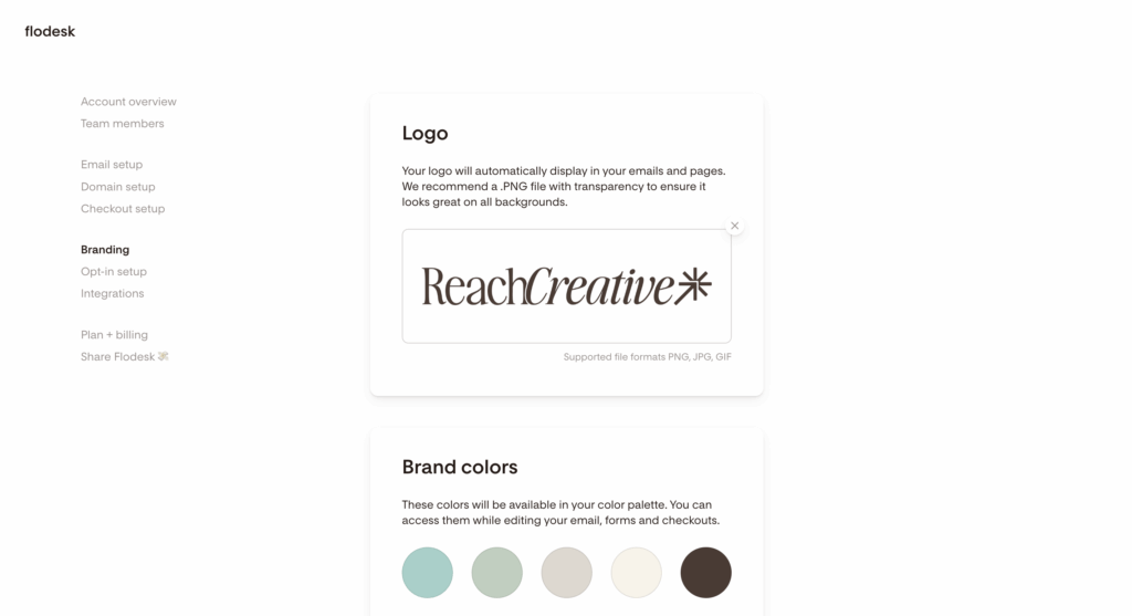
3. It’s created for small businesses who care about how they show up
This is something I really appreciate. Flodesk was built by founders who get what it’s like to run a business where every touchpoint matters. They built a tool that supports that level of intention.
What’s New: Flodesk’s Evolution in the Best Way
This part makes me weirdly excited because you can see how quickly the platform is growing — and how much they’re listening to creators and small business owners.
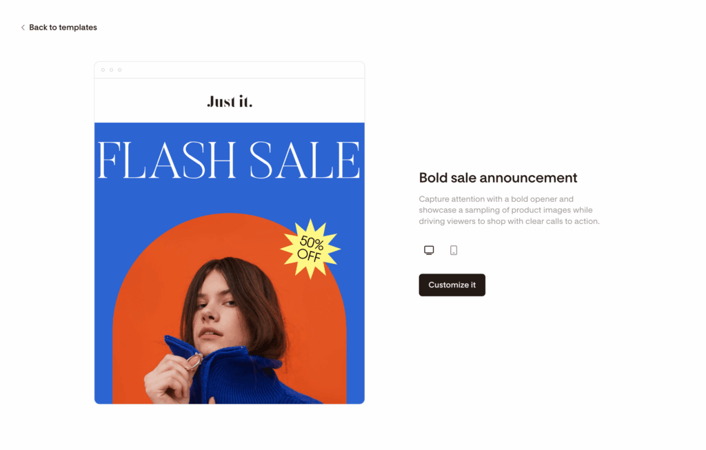
New templates and design blocks
They’ve added layouts that feel like mini landing pages. Gorgeous typography, beautiful spacing, more structure… basically, designer candy.
Improved automations
Simple. Visual. Clear.
Perfect for welcome sequences, funnels, or any “set it and let it run” moment.
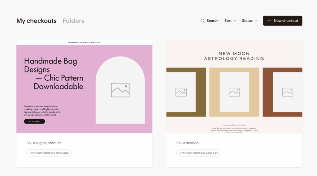
Better forms and checkout features
Their form builder has gotten a major upgrade.
And if you’re selling a guide, template, or workshop? The checkout options are streamlined and on-brand. No more duct-taping different tools together.
Integrations that make sense
Instead of becoming a bloated all-in-one, Flodesk integrates with the tools you already use.
It stays focused on being the best email platform on purpose.
Why This Matters From a Brand Perspective
Your email list is one of your strongest marketing channels. It’s where relationships deepen, sales happen, and your voice actually gets heard.
When your emails match the quality of your brand, everything feels more aligned:
- higher trust
- stronger connection
- a more memorable experience
- better conversions
The inbox becomes an extension of your brand — not an afterthought.
Who Flodesk Is Perfect For

If you care about design, clarity, and a seamless brand experience, you will love it.
It’s ideal for:
- service providers
- creatives
- premium brands
- coaches
- small business owners
- anyone who wants their emails to feel polished and intentional
If you want ultra-complex, multi-branch automations and deep CRM tagging, you may want something more advanced. But most modern businesses? This is exactly the right level of powerful and simple.
My Honest Take (Partner Hat On)
I recommend Flodesk because it’s the tool I use and the one I guide clients toward when they want their emails to look and feel like their brand.
It’s beautiful, intuitive, and always evolving in the right direction.
Yes, I’m a partner. But I was a loyal user long before that link ever existed.
Want to Try It?
If you’re ready to design emails that feel like your brand. Polished, intentional, beautiful, try Flodesk free for 14 days.
You can use this link or my code REACHCREATIVE for 25 percent off your first year!